Shopify Mobile Optimization: Turn More Mobile Visitors into Buyers
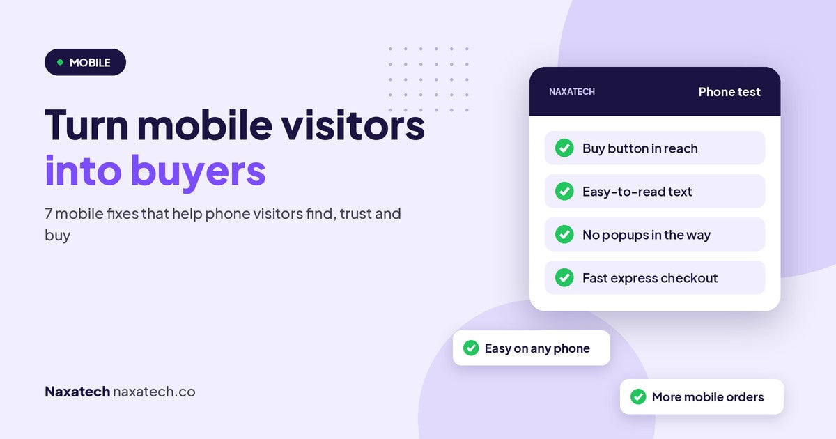
Here's something I ask almost every store owner I work with: when did you last buy something from your own store, on your phone, from start to finish?
Most people build and check their store on a laptop. Most of their shoppers use a phone. That gap is where a lot of sales disappear. In about ten years of running Shopify stores, and helping more than 1,500 store owners with my team, mobile problems are some of the easiest to miss and some of the quickest to fix.
Before you change anything, do this simple test.

Quick answer: how do I turn more mobile visitors into buyers?
Most mobile visitors leave because the store is slow on a phone, the buy button is hard to find, popups cover the screen, the text is too small, or checkout takes too many steps. Test your store on your own phone from homepage to payment, then fix what gets in the way, starting with speed and the buy button.
1. The buy button is hard to find
On a phone, the product photo often fills the whole screen. The price and the add to cart button can end up far down the page, and some shoppers never scroll that far.
The fix: make sure the price and buy button appear high on the page, close to the photos. A sticky add to cart bar that stays at the bottom of the screen as shoppers scroll works well for most stores.
2. Popups cover the whole screen
A newsletter popup on a laptop is a small box. On a phone it can cover everything, and the close button is often tiny. Some shoppers can't close it at all, so they leave.
The fix: delay popups until a shopper has looked around for a while, make the close button large, and use a small banner instead of a full-screen popup on mobile. Never show two popups at once.
3. The store is slow on mobile data
Your store might feel fast on office wifi. On a phone with a weaker connection, large images, heavy videos and too many apps can make it crawl. Shoppers don't wait.
The fix: compress your images, remove apps you no longer use, and avoid autoplay videos at the top of the page. Test your mobile speed with Google's PageSpeed Insights. I go deeper on this in how page speed quietly cuts your sales.
4. Text is too small and buttons too close
If shoppers have to pinch and zoom to read your product details, or keep tapping the wrong link because two buttons are squeezed together, they get tired of your store fast.
The fix: keep body text at a comfortable size on mobile, give buttons enough space around them, and keep lines of text short. Read your own product page on your phone without zooming. If you strain, so do your shoppers.
5. The menu is hard to use
A menu with lots of levels and tiny arrows works on a laptop and becomes a maze on a phone. Shoppers who can't find the right collection quickly start searching on another store instead.
The fix: keep the mobile menu short, name collections the way shoppers think, and make the search icon easy to see. Here's a full guide to organizing your menu and collections.
6. Important details are hidden
To save space on mobile, many themes tuck sizes, shipping, returns and reviews into closed tabs. Shoppers don't always open them, so they never see the information that would have convinced them.
The fix: show the key buying information openly, near the buy button: delivery time, returns in one line, and your star rating. Keep longer details in tabs if you need to, but give them clear names.
7. Checkout takes too many steps
Typing a full address and card number on a small screen is slow and annoying. Every extra field is another chance for the shopper to give up.
The fix: turn on express payment options like Shop Pay, Apple Pay and Google Pay, so shoppers can pay in a couple of taps. Remove optional fields you don't need, and don't force shoppers to create an account before they can buy.
Test again after every change
Mobile problems creep back in when you add a new app, a new banner or a new section. Make the five-minute phone test a habit, ideally after every change to your store, and try it on more than one phone if you can.
Done for you
The MobileMagnet Plugin
Want this done for you? MobileMagnet is our done-for-you mobile fix. Our developer goes through your store on real phone sizes and fixes the layout, buttons, popups and checkout steps that get in the way, so phone visitors can find, trust and buy without a struggle.
Frequently asked questions
How do I check my store's mobile speed?
Use Google's free PageSpeed Insights and look at the mobile score, then try your store on your own phone using mobile data, not wifi. The real-world feel matters as much as the score.
Do I need a separate mobile version of my store?
No. Modern themes adjust to every screen size. What you need is to check how your pages look and work on a phone, and fix the parts that get in the way.
Is a sticky add to cart button worth it?
For most stores, yes. It keeps the buy button in reach while shoppers read your product details, which is exactly when many of them decide to buy.
Should I turn off popups on mobile?
Not always, but be careful with them. Show them later, keep them small and make them easy to close. If a popup is hard to close on your own phone, change it.
Want me to check your store for you? Run the free store audit, read why shoppers don't trust a new store, or message me on WhatsApp.
Brian Cole, Naxatech
Get the exact steps to fix it
Each Growth Kit gives you the steps, settings, templates and a checklist for this problem. Download it instantly and work through it at your own pace.